Trends, Website Top 5 trends for web design in 2020

As we enter a new year and a new decade, we take a look at 7 of the top trends for web design in 2020 and beyond. As technology and style changes, so too does web design. By keeping a finger on the pulse with all of these, a web designer can ensure that they are able to adapt to changing trends while still delivering something that suits their client’s brand or business. We look at some of the big trends for web design in 2020 and see how they can be applied in a relevant way.
Illustrations
A really fun web design trend that we’ll be seeing more of in 2020 is illustration, particularly illustrations that are hand drawn. These elements can be used across every aspect of a website to give it an adhesive slow while being very fun and engaging for the user. They can be really unique, leaving a lasting impression with the user and create a strong brand recognition.
A lot of time and effort can be put into these illustrations and more personal ones will prove to be the personal touch that a brand can expect to impact their customers. A branch of this trend is abstract illustrations and illustrations that either form a background pattern or integrate with the function of the web page itself. When executed to a high standard, this trend really helps a website stand out from the crowd.
3D interaction & animations
Going one step further than the illustrations trend is 3D interactive elements and animations. This trend could be seen as a natural progression for website design. While some website designers are doing a loop and returning to traditional website designs by stripping it all back, there is a trend on the flip side and that is utilising 3D animations and making them interactive.
3D technology is only getting better and better and so are animators. Finding ways to integrate it with a website is both a creative and technical challenge that many have mastered. When done well, whether it’s a simple or complex animation, this can greatly enhance a users’ experience on a website and make them more engaged. This is one way a website can jump ahead of its competitors and be remembered by many.
Jumbo feature text
With the uptake of mobile use in past years it is important for websites to be as user friendly as possible. This has lead to web designers increasing header sizes and using them more often. Shorter blocks of text broken up with headings and subheadings are a lot more user friendly on a smaller device. If a website is not designed with mobile compatibility at the forefront then there is some serious lack of judgment!
Using headings and subheadings is also a tactic for increasing a website’s SEO, as these are elements that are recognised by search engine crawlers. SEO is a fine yet vague art and there are ways of improving a website’s likelihood of showing up on top of search result pages. Formatting tools are important to achieve this so do not overlook their value. But user friendliness and SEO are not the only reasons for larger text.
A lot of web designers are using large text as a design feature, with a large header being the feature of a landing page instead of an image or video. This design tool is simple yet effective when used with a stylish font. One trend within this trend is to have a font that does not have any colour fill, only the outline of the font. This is stripped back design also works well with another design trend mentioned later; visible wireframes.
Whitespace as a design feature
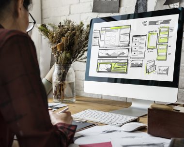
Visible wireframes
Another trend that has website design being stripped back is visible wireframes. Creating a wireframe is one of the earlier steps of building a website and usually the lines created in this step of the process will be gone by the final step. They are like the skeleton of a website, creating the structure before all the rest is added in. But this trendy look is achieved by the designer embracing the structure of a website and using it as a feature rather than hiding it. They will leave in the lines that border separate elements to give it a more composed feel. It is an exposed look which will make the web page appear a bit more structured and makes it easy for the eyes to seek out what is important on the page. It does not have to be this way across the whole page either, some sites will just have it in the header or on some elements across different pages.
Overlapping layers and features, including mixing photography, videography and digital elements
Another trend that is becoming more popular with designers who like to think outside the box is designing outside the box. There are several different trends that leak into this one, such as large text, use of negative space and illustrations. Other elements that can be incorporated into this trend are photos, videos, interactive elements and colour/gradient blocks. Designers using this trend look beyond where things go. Reminiscent of scrapbooks and photo collages, this trend gives designers more freedom to be creative and leave their mark on the site. Multiple elements are stacked on top of or beside one another, making the page intriguing and dynamic.
Dark UI
With society spending more time in front of screens, it has become obvious that this has negative side effects. Too much screen time can cause headaches, poor eyesight and without a filter, the blue light that most screens give off causes the brain to be more alert and will make sleep harder for the late night browser. A dark colour scheme based around black instead of white can help offset some of these negative effects and as a result, a lot of designers are now going to the darkside. It does not have to mean regressing back to the black screen with green block text, but designing with black and darker colours can have some very interesting results and will help distinguish a website from its competitors.
Along with the advantages of being better for the body, white on black is a good move for design as well. The contrast of light text and imagery on a black background really pops and the contrast makes it very easy to read. It can also make a website less cluttered by making it seem like there’s less space to fill.

Trends come and go so it is important to chose one that works for the brand and keeps them relevant. Sometimes it is a hard balance between what is trendy and what will suit a brand in the long run but that is where it is important not to rush a good thing. At Actinium we strive to deliver websites that are beautifully and thoughtfully designed while analyzing trends to see whether they will work for our client or not.